When we learn chart patterns in Forex for the first time, we’re damn near mesmerized. For the first time ever, we could start to make sense of a price chart.
From this point forward, chart patterns had a grip on us.
This was not a good thing.
Wheeeeeeee! Shapes!
Before we go too far, I did make a video on this. Like to here it go!
But back to the shapes.
We were trained from a young age to recognize shapes and patterns. Most of us learned about these even before letters and numbers.
That’s pretty strong. One of the FIRST things we were taught!
It’s how we first learned to make sense of the world around us. So it was no surprise that we resonated with chart patterns so quickly and so well.
And how we we’re never able to get away from them, despite the fact they don’t work often enough for us to use.
“Well What About THIS And What About THAT?”
Defenders of chart patterns will go to great lengths to try and debunk the idea of these things not working well.
I see it every time I do a blog or video on a tool in the Dirty Dozen.
Comedian Bill Burr said it best, and I’m totally paraphrasing but it went something to the tune of:
“It’s all jokes and they’re all laughing until you talk about the thing that THEY like. Then all of a sudden they’re not jokes anymore.”
But damned if I haven’t noticed this phenomenon.
“LOL VP, couldn’t agree more, but you’re dead wrong about the RSI Indicator.”
The problem with chart pattern devotees, because of the reasons stated at the beginning of this blog post, prying their cold dead hands off of these things is really hard to do.
They’ve also probably read Thomas Bulkowski’s numerous works (forgetting they were for stocks and not Forex), and subscribe to their daily injection of chart pattern videos.
Or, for the deep cultists, they strictly trade Harmonic Patterns, which I don’t feel the need to blog about, but did do a podcast episode on, so just view it below if you like.
I’ll do my best to explain why Chart Patterns don’t work, fruitless as it may be to some.
Don’t Forget How They’re Drawn
For a short list of patterns, babypips has some listed here. You should have already gone through their school however, so this isn’t new.
Many of these patterns need to be drawn first so you can best see them, and know when to use them.
And what do we (sometimes unknowingly) use to draw things like triangles and wedges?
Trend Lines. Dirty dirty Trend Lines.
And if you remember in that blog post (click the link in the line above), I showed how nobody ever draws them the same way, rendering them fairly useless from the start.
And now, instead of relying on one inaccurate trend line, you’re now relying on TWO of them to get the job done.
Just when I thought there wasn’t anything worse than relying on a trend line to predict price, now you have to rely on two of them working together with each other!
Es no bueno.
Hindsight is 100/0
It’s hard to imagine something not working, when all you see is examples of it working perfectly every time.
And Forex Twitter and Forex websites do a bang-up job of this.
But there’s a real problem this, and Forex education has caused us.
When looking at a chart now, for us, we can only visualize patterns that worked, and we can no longer spot the times where it did not.
They have us THAT trained.
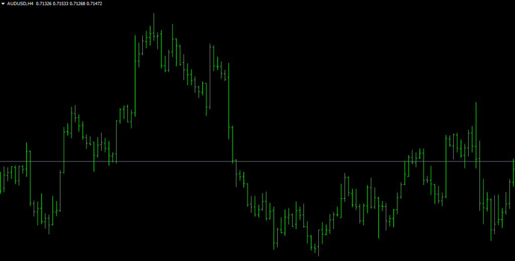
Don’t believe me? Let’s look at a chart right now and see what we see. I’ll use bars this time to make shape and pattern recognition even easier.
Tell me what patterns you see, especially on the left half of this chart.
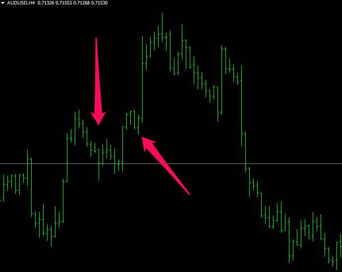
You may have seen two successful bull flags here.
But bruh, those aren’t even flags.
I guess the first one could be, but you would have to be really really liberal with your drawing of trend lines
But good luck drawing patterns this way in the future. You could pretty much make anything a pattern if you’re doing that.
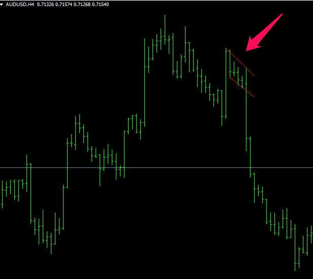
And if you said the one next to it was a flag, you’re just flat out wrong.
No amount of creative trend line drawing can make this particular fairy-tale come true.
And be 100% honest here, if you saw that thing form in real time, you’d never consider it to be a bonafide chart pattern.
So 0 for 2. Or I should say 0 for 0, since they’re not even really chart patterns.
The closest thing to an actual bull flag on there was a total failure. Did you happen to catch it?
And I didn’t see much on the right half of this chart as far as patterns go, if I missed it I missed it, but didn’t see anything noteworthy either way.
Yes, there’s a very rough, slanty, Head-And Shoulders pattern there too that appeared to work, I saw it, don’t @ me.
I did cherry-pick this pair and time frame because it was great for illustrating my points and we could accomplish this by staying with one type of pattern for consistency’s sake.
But even though some patterns that occur on a chart do work sometimes, far too often we draw them all fucked up, give them too much credit in hindsight, and are unable to spot the ones that fail.
I felt like this particular chart was a great example of all three.
You can do this just about anywhere though. And if you see some where they work tremendously, keep going. You’ll soon see how the failures balance everything out in the end.
Actually, somebody already did take the time to do all of this research. More on this in a minute.
But first!
Straddling
While we’re here, let’s go over this real quick.
So people think they’re slick on these because they do something called “Straddling”, where they see a triangle form for example, and put an order above and below price because “it’s bound to break out somewhere”.
Just remember, you’re not the only one who does this.
And also remember, the Big Banks can see where the orders are!!
And if they see people doing this, they can easy take price one way to knock out one set of orders, take it the other way and KO the other set of orders, THEN take price wherever they intended to originally take it.
Happens all the time. And since it’s free money for the Banks, why wouldn’t it happen all the time?
I just wanted to get this idea out of your head before it had the chance to entrench itself there.
Thank me later.
Fist-Bumping The Enemy
One of my biggest competitors on YouTube, The Duomo Initiative, put out a great study on chart patterns, to where they really got in there and did tons of actual research on this.
And, as you could imagine, the results were not pretty. Go here to see it. It should take you to the right point in the video I’m referencing.
Props to Duomo on this one. I agree with this, and lot of their psychology stuff, but strongly disagree with much of the rest of their videos.
I wanted to burst into flames when I saw their flash crash video.
But in all fairness, for me to agree with anything another Forex trading channel says is pretty remarkable, so good on you folks over there.
Conclusion
If there are any chart pattern lovers out there after this, I still wouldn’t be surprised.
The grip is strong.
Stronger than one blog post, with a video of actual hard evidence behind it unfortunately.
But if anything, please start looking at these with a more objective eye.
And if you want to part ways with these things one day, there’s a lot of money waiting for you on the other side.
— VP


